Thursday, May 6, 2010
Neon signs

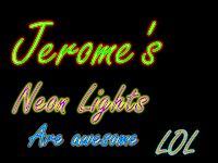
I decided to learn how to make neon signs out of text in inkscape, and I thought that it was one of the funnest ones that I've ever done. I thought it was fun, because it looked good in the end, and you can change it however you want. Above is what I achieved. The hardest part was to find out which colors fit best together!! :)
Wednesday, May 5, 2010
Stylizing texts

In class, we got to take some lessons on stylizing some text. We had to do two of the tutoriols first, and then we can choose whatever we want. This is one of the first two tutoriols that we had to do. It was quite easy, because it is almost exactly the same as the funcalicous one. Above is the one I made.
Monday, May 3, 2010
Funcalicous

In a class we got to learn how to make funcalicous text. Above is what I achieved. I thought it was quite hard to follow, but then in the end it was really easy to do, because you just have to type text and make it into a path, and then put it to Dynamic Offset. Then you have to pull up the only node. Now its time to learn some more!!
Thursday, April 22, 2010
Patterns for snowboards
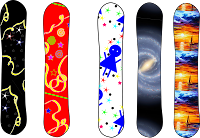
In a class we learned how to make patterns for a picture, like a snowboard, a surfboard, shoes, shirts etc. I decided to use snowboards, and I think that the snowboards look really good, even though I only made 3 of the five patterns. The galaxy and the boat with the sunset are from the internet. I think it is quite fun to make the designs, because you can make whatever you like with no one telling you what to make.
Wednesday, April 14, 2010
Retouching Pictures
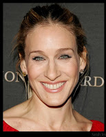
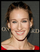
In a class, we learned how to change pictures from how the picture origanaly looked like. Above is one of the pictures I changed. We learned how to clone other pieces of skin, to put on top of another piece of skin. I saw a big difference after looking at the original and then at the one I changed, I thought it looked quite natural with the change. It is best, when you don't see that there was something changed.
Thursday, March 11, 2010


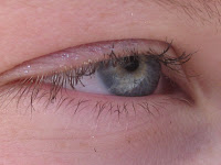
When we took macro pictures, I thought that the pictures would look quite normal, but I found out that the closer you get to the object the cooler it looks like, because you can see the little details that you normally wouldn't see. Above you can see some of the pictures we took, but I had some technical problems, so Annie the Great had to give me the pictures. I like the eye the most, because you can see the field inside the eye. The way the eye is half closed it gives the whole picture a good effect.
Thursday, March 4, 2010
The Dawn of a New Spring
This picture is a really good example of rule of thirds, because the flower isn't exactly in the middle of the picture. It is in the top right corner of the picture. This also demonstrates a good idea of trying to get your picture more in focus, because it is hard to see the flower that well. I sometimes feel like I need glasses when I look at the flower.
Solitude
I chose this picture, because the dock is symetrical, and so is everything else on the picture. I also chose this picture, because the black and white gives a good effect to the picture.
Olympus E-620, Kiron 105mm f2.8
This is one of my favorite pictures from last 7 days. I chose this picture, because it shows texture, for example the blue part of the flower, and the smoothness of the bee.
Wednesday, March 3, 2010
Photography


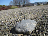


One lesson we got to go outside and take pictures. We learned that a picture can get a good effect, and looks good with the backround out of focus and a subject that is in focus. I think that the picture I took with the bench is really good, because the bench is in focus, but the backround isn't. I also really like the picture with the rock, because it is in focus and the other little pebbles look really good like with the bench. I also think that it looks good because the view widens out starting from the rock and going to all the other pebbles in the back. The second picture didn't work how I wanted it to, because I think I forgot to focus on my subject. The first picture also didn't work well, because I was trying to get the twig into focus and not the rest, but I think that the twig was to small for the camera to focus on.
Thursday, February 25, 2010
Bear family goes on a picnic

When I learned how to make a landscape for the animals, I thought that the animals looked a lot better and more at home. I added a few of my own things like the pond, the ants with the ant hill, the grass tufts and the reeds, also the little dropplets fallinf onto baby bear. We had to think of a place where our animals would look best in. I thought that the bear family would look good going onto a picnic, but I forgot to put in the food. I think that I made the picture a bit to small, because the picture is really small. I was starting to trace a turtle, but was unable to finish it.
Thursday, February 4, 2010
Monkey
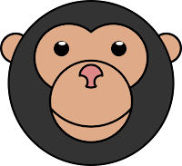
When we got to make animals, we learned how to so different kinds of path operations. For example like on the monkey above, we learned how to make the mouth without the bezier tool. We also learned how to make the eyes by using union. Union makes two shapes "melt together". We also learned how to cut away peices like on the nose. For cutting away the peices we used two circles to cut away the peices from the bigger circle, the nose. We have learned a lot, but its worth it, because the animals or other things look a lot bettter.
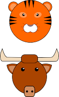 In a lesson we were allowed to choose an animal that we were allowed to make. We had to learn new obeject operations. For example, we learned how to make the stripes on the tiger. I also learned, that if you union something, then you have a shape that is made of two shapes but looks like one. We learned lots of other things to use for individual animals.
Monday, February 1, 2010
Valentine Card
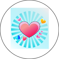
After we had finished the first activity, we were allowed to do another activity on inkscape. I decided to make the valentine heart, because I wanted to have something challenging and interesting to work on. I wasn't able to finish the activity, but I still learned how to make a circle out of a triangle, for the card. I used a lot of gradient and I had to make a lot of hearts, so that the card wouldn't look so empty. There were vines on the example, but I wasn't able to get to that. I would have liked to learn how to make those vines, because they made the card look a lot more interesting. Above you can see how far I got in making the valentine card.
Thursday, January 28, 2010
Making an easy penguin
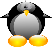
In a lesson, we got to choose to make anything. We had instructions on what we had to do. I chose to make a penguin and I thought it was really hard to make, but it turned out to be a lot of circles, ovals and three triangles. I had to use a lot of gradient to make the penguin look like it is 3D. After I made the penguin, I decided to make a sort of valentine heart. You can see above what my penguin looks like.
Monday, January 25, 2010
Making a Cartoon Head from Youtube
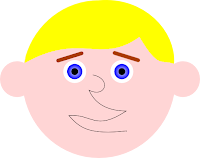
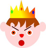
During a lesson we learned how to make an easy cartoon head. We also learned about a lot of different tools. For example, we used the bezier tool so that we can make freehand lines or shapes. We made the cartoon head's hair with the bezier tool. We then learned to use more nodes and gradients, so that we can change the cartoon head's hair however we want. We learned that we can intersect 2 different shapes from each other. That is what we used to make the hair for the cartoon head. After we made the cartoon head like in youtube, we got to make our own that is like the one from youtube, but make by our own imagination. Above is a cartoon king, which I made from my own imagination. Next to it on the left is the one that I made while using youtube as my instructions.
Thursday, January 21, 2010
Learning about inkscape and making shapes.


When I learned about Inkscape, I learned about all the new tools, and how to make a basic shape, like a circle, star etc. Then we learned how to make a basic heart shape from a circle. We then learned how to make the heart look like it is 3D. We then learned how to make a bone from a triangle. We also tried to make a clover, and it didn't always end up as we wanted to make it look like. We were also challenged to make a heart out of a triangle, which is a whole different thing to do. Now these shapes seem so easy after we learned it, but we always find out new things to make the shapes look better. Above are some examples of the shapes that we made.
Subscribe to:
Comments (Atom)

